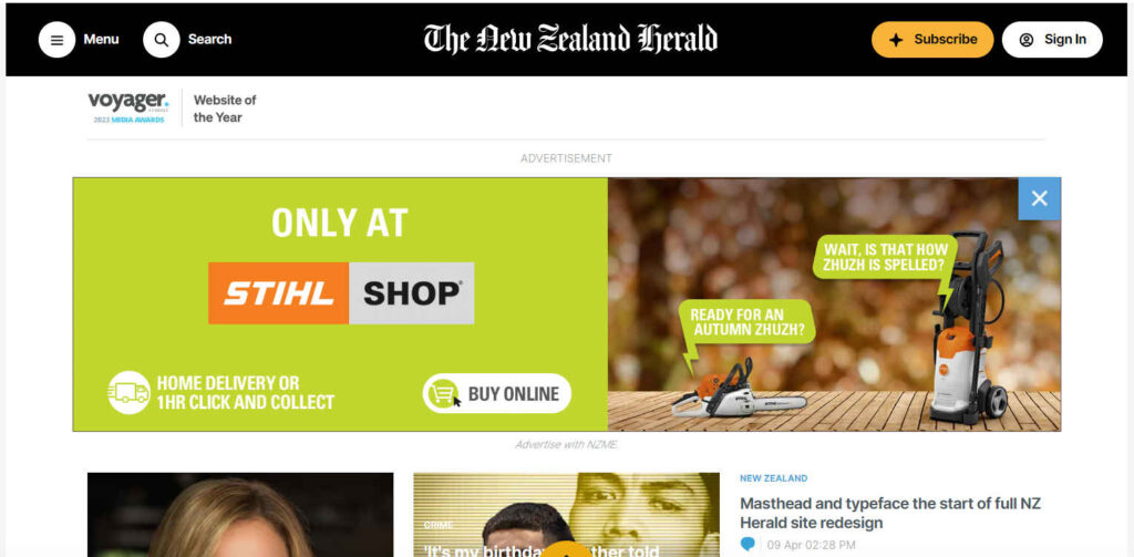
Legacy media outlet the New Zealand Herald has announced a series of changes to its website and app, marking the beginning of a comprehensive redesign.
Notable alterations include the reinstatement of the Herald masthead at the top of the website and an update to the typeface for improved readability. The redesign will be implemented gradually, with feedback from users being considered throughout the process.
Structural adjustments will also be made to the presentation of Opinion content, with clearer labeling and homepage signposting. Additionally, plans are underway to introduce new advertising formats aimed at enhancing the reader experience.
The ultimate goal is to unveil a completely revamped website by the end of the year, featuring regionalisation and personalisation capabilities, said a report on the Herald’s website.
The latest AUT Trust in News report showed the Herald’s ‘Trust Score’ slipped 6% over the last 12 months to 4.7 (out of 10), down from a high of 6.3 in 2020.
Polishing a turd isn’t going to change anything, it will still be a turd
BASED
Quite, and nicely debased.
Too late. Too many lies and opinions.
May the NZ herald propaganda go where it belongs: Dustbin of the woke.
Oh, I thought it might be coming in rolls, with slogans like soft, super soft and double ply…..mistake!!!
LOL classic!